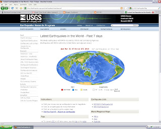
The USGS Maps show how many earthquakes and of what magnitude are happening every day!
Source: http://earthquake.usgs.gov/earthquakes/recenteqsww/
 In order to improve this map I added a monochromatic color scheme of blues to show the variations. I believe if printed in black and white it would still show a good amount of gray variation but it is a lot more attractive in color. Keeping the single color scheme for all four maps is important to be able to compare the classification schemes. I also added my name and the date the map was revised.
 For this map I added the state boundaries for context in the locator map. I refined the line weights to match the “Zoom In “ map. I selected another part of the map to highlight and I refined the scale bars used in each map. I retitled the legend to be more accurate to the content. I put the original river line before simplification behind the others for comparison purposes. I liked this exercise for seeing the effects of simplification. I think the “Zoom In” map on the first map actually shows the differences better but I thought it was too exaggerated, too far zoomed in.


The original map was set up with a cool 'neat line' but was too small. I also thought a locator map might help those unfamiliar with the State of Colorado.