skip to main |
skip to sidebar
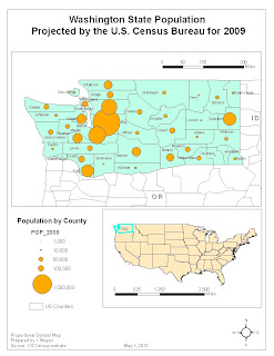
WA Population by County
 For this map I wanted to examine the population of Washington State by comparing the county populations. Population is a foundation for planning. The role of planning in terms of population is to direct where development will take place. These types of decisions, usually incremental, are made in conjunction with political leaders and other professionals and stakeholders.
Washington leadership has taken steps to regulate growth in more heavily populated areas using a law called the Growth Management Act (GMA). Each county and municipality is required to have Critical Areas Ordinances to protect and regulate activity. The less populated counties such as Whitman County are not required to create as much regulation as more populous counties under the GMA. Population concentration or de-concentration is also a factor in where lands can be conserved, where natural resources can be mined or harvested and where agricultural activities can take place.
The map shows a heavy population in King County and along the Interstate 5 (I5) corridor and in Spokane County. From the map I can see several counties that have a similar size population as Whitman County where I work. There are several counties with even smaller populations.
To make this map I downloaded population projections for 2009 from the U.S. Census website. The U.S. Census is a more reliable source for projections than any other because their projections are based on trends since population data has been collected. I also used the congressional districts I had downloaded for the first map. I also downloaded the county boundaries from the U.S. Census website. I cleaned up the data in Excel and used the JOIN function to put the data into the attributes table, joining the tabular data with the shapefile. I selected proportional symbol dots to illustrate the population data. I did not use the psychological scaling to resize the dots since there is only one largest dot and it is already covering the whole county outline. I did not use a white outline because there was not too much overlap like some of the population maps we have seen and created. I went back to what we learned in Lab 6 to make this map. Dots are a standard way to illustrate population, so I like using this method. It matches the use of raw data.
I had several issues with this map including several fixes that I believe are now repaired for the final version. I had selected WA state on the location map but when I was working on reprojecting, I lost that selection. I also did not like the green-on-green color scheme that I had originally chosen. The scale bars were a challenge because the scale was off until I reprojected but it was a little difficult to get a standard scale and to fit the scales into the map visually. I chose the projection that was default in the new data frame and reprojected the data to match that one: North American GCS 1983.

No comments:
Post a Comment